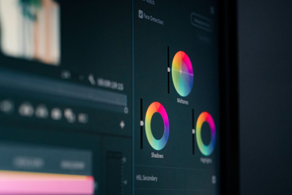
Warmer tones, deeper shadows, and richer saturation can reshape how a photo or video feels. Warm highlights can make a kitchen feel lived-in, while cool shadows can make that same room feel distant. Your technical corrections become a deliberate visual choice.
This overview covers color correction, white balance, shot matching, skin tones, LUTs, photo workflows, video continuity, and final delivery checks for your images and footage.
Color Choices Turn Technical Edits Into Visual Intent
A flat frame can hold accurate detail and still feel emotionally blank. Color grading changes hue, luminance, saturation, and contrast with a clear purpose. Your choices can suggest warmth, danger, calm, memory, luxury, grit, or restraint without changing the subject.
The result appears in how attention moves through the frame. Darker surroundings and brighter facial midtones can pull your eye toward a portrait subject before clothing or background details compete for attention. That shift affects how color grading affects photos and videos at a basic visual level.
Style Comes From Controlled Relationships
Color relationships matter more than one dramatic slider move. A muted green background beside a warm face creates separation because the hues pull in different directions. Your image gains depth through differences in color, brightness, and saturation rather than saturation alone.
Subtle choices can carry as much style as a bold palette. A wedding photo can benefit from warmer skin, softer highlights, and gentle contrast, while a street portrait can suit cooler concrete, deeper blacks, and restrained reds. Your grade should suit the subject and setting instead of copying a trend.
Polished and Raw Looks Serve Different Stories
Polish does not always mean smooth, bright, or colorful. A raw visual style can leave grain visible, preserve gray shadows, and mute intense colors so a scene feels documentary-like. You decide whether the final image feels refined, immediate, nostalgic, severe, or natural.
| Visible change | What viewers perceive | Practical example |
|---|---|---|
| Warmer highlights | Comfort, sunlight, intimacy | Golden late-afternoon family portraits |
| Cooler shadows | Distance, calm, tension | Blue-gray office scene in a drama |
| Lower saturation | Restraint, age, seriousness | Muted documentary interview footage |
| Focused brightness | Clearer subject hierarchy | Bright face against a darker hallway |
That visual intent needs a stable technical starting point. A warm cast from indoor bulbs or an underexposed face can look stylistic at first glance, yet it limits every creative choice that follows. Your next task is separating accidental color from deliberate color.
Color Correction Creates a Neutral Base Before Styling
A blue-white shirt should not turn orange because the camera misread the light. Color correction fixes exposure, white balance, color casts, and mismatched shots. The creative layer comes after the source material behaves consistently.
Color grading vs color correction describes an editing sequence, not a rivalry. Correction aims for believable, repeatable color balance. Your grade then moves that balanced image toward a chosen feeling, so a richer sunset still begins with plausible skin tones and neutral whites.
Technical Correction Comes Before the Creative Pass
Start with the correct camera profile or color-management setting. A RAW profile in Adobe Lightroom affects how highlight and color data appear before you touch the controls. Log footage needs the proper color transform before it resembles standard video.
- Set the input profile. Match the camera file to the right RAW profile, log transform, or working color space before judging color.
- Correct exposure. Place faces, walls, clouds, and key tones in a believable range without clipping bright areas or burying shadows.
- Neutralize white balance. Use color temperature and tint to remove unwanted blue, orange, green, or magenta casts from neutral objects.
- Match related frames. Bring similar photos or adjacent video shots into the same exposure and color family before styling them.
- Shape the look. Adjust contrast and selective color after technical differences stop distracting from your intended mood.
- Review skin values. Check faces beside neutral clothing, walls, or paper so stylized color does not turn skin green, gray, or orange.
Your edit can still change before the final color pass. Trim video, stabilize clips, add visual effects, or reframe a shot before final styling, because those edits can reveal new edges, alter brightness, or place two formerly separate shots together.
Correct a gray wall, white shirt, or neutral tabletop before judging a creative palette. A stylized cast is easier to control after the original color is stable.
Neutral does not mean lifeless. It gives you a trustworthy reference point, making warm and cool shifts feel deliberate rather than accidental. That foundation also keeps mood choices from hiding technical problems.
Mood, Focus, and Perceived Quality Shift With Color
Warm amber light can make a sparse room feel welcoming, while steel-blue shadows can make that same room feel lonely. Color temperature carries emotional associations because your eyes link warm hues with firelight, sun, and skin, while cool hues recall shade, water, metal, and night.
Your grade does not force one emotion, but it steers interpretation. Warm tones can suggest energy, comfort, intimacy, or nostalgia. Cool treatment can suggest calmness, distance, isolation, or tension, while sickly green highlights can make a horror scene feel uneasy.
Contrast and Saturation Change Perceived Quality
Contrast changes the distance between dark and light areas. Moderate contrast can give a face dimension and make a product edge look crisp. Heavy contrast can crush texture in black hair, dark jackets, or night skies, leaving your image harsh instead of rich.
Saturation controls color intensity, not emotional depth. A small saturation lift can make a red coat hold attention, while a large global increase turns foliage neon and lips unnatural. Your work looks more credible when intensity varies across the frame instead of rising everywhere at once.
Consider a coffee commercial filmed near a window. Deep brown beans, a warm cup, and pale foam can look inviting with soft shadows and gentle amber highlights. Push orange too far, and the cup looks stained; push contrast too far, and foam detail disappears.
Brightness and Color Direct Attention
Selective brightness works like a quiet spotlight. Brighten a face slightly, darken a distracting wall, and your eye lands on the person before scanning the room. Masks, mattes, and power windows isolate those changes without shifting every pixel.
Complementary hues can sharpen focus as well. Orange skin against a restrained teal background is a familiar film treatment because the colors separate strongly. But aggressive teal-and-orange work distorts skin, so your face tones need a separate check after broad hue changes.
The 60-30-10 filmmaking rule helps before post-production starts. Roughly 60 percent of a frame uses a dominant color, 30 percent carries a supporting color, and 10 percent acts as an accent. Your accent could be a red jacket in a blue room, giving the frame hierarchy without heavy editing.
The same visual hierarchy behaves differently once time and movement enter the frame.
Still Images and Moving Footage Need Different Decisions
A photograph has one decisive moment, giving you more local freedom. Darken one corner, brighten a flower, or cool a distant mountain without worrying about what appears half a second later. Your goal is a self-contained image that holds together on its own.
Video adds time, movement, and neighboring shots. A face that looks natural in one close-up can look green beside a wide shot from another camera. Your work needs continuity across lenses, angles, locations, and changing weather so attention stays on the story rather than color jumps.
| Priority | Still photography | Moving footage |
|---|---|---|
| Main unit | One finished frame | A sequence of connected shots |
| Local adjustment | More freedom around one subject | Must remain stable through motion |
| Consistency target | Photo set or gallery | Scene, sequence, and full program |
| Key concern | Composition and individual mood | Shot matching and narrative pacing |
| Useful data source | RAW file | Log or RAW video file |
Color grading for photography can focus on a single finished frame, while it for video must account for every cut around it. That difference changes how far you can push a local mask, a hue shift, or a contrast curve.
File Format Sets Editing Latitude
RAW photos retain more sensor data than JPEG files, leaving wider room to recover highlights and shift white balance. Log video stores a flatter image so more tonal information survives capture. Your footage can tolerate broader adjustments before artifacts appear, though log material still needs correct conversion.
JPEGs and standard Rec. 709 video already contain camera processing. Strong pushes can reveal banding in skies, blotchy shadow noise, and broken colors around saturated signs. Your safer route with those formats is smaller changes spread across several controls.
Continuity Adds a Video-Specific Task
Shot matching means equalizing exposure, white balance, contrast, and skin appearance between related clips. A daylight wide shot, indoor close-up, and handheld insert can belong to one scene after your corrections make them feel cut from the same cloth.
DaVinci Resolve is widely used for this work because its node system and scopes separate technical and creative adjustments. Adobe Premiere Pro and Final Cut Pro also include tools for matching and secondary corrections. Your software matters less than the order and discipline behind each adjustment.
Core Controls Shape Realism and Style
White balance sets the emotional floor beneath every later adjustment. Color temperature moves the image toward blue or amber, while tint moves it toward green or magenta. Your creative shift looks cleaner after paper, walls, or stainless steel stop carrying an accidental cast.
Mixed lighting calls for judgment rather than blind neutrality. A room lit by warm lamps and cool window light contains two valid color sources. You can leave warmth in the lamps while keeping skin believable instead of forcing the whole frame into one flat temperature.
Tonal Controls Preserve Detail
Use blacks, shadows, midtones, highlights, and whites as separate zones. Blacks set the deepest point; shadows recover dark detail; midtones hold faces; highlights shape bright surfaces; whites define the brightest usable areas. Your image stays more natural than it would under one aggressive contrast slider.
Watch for crushed shadows and clipped highlights. Crushed shadows lose texture until a dark jacket becomes a featureless shape. Clipped highlights lose information until clouds or white fabric become blank patches, and your histogram reveals those losses in a photograph.
Selective HSL Work Limits Collateral Damage
Hue, saturation, and luminance (HSL) controls adjust a specific color family. Lower blue luminance to deepen a sky, reduce green saturation in grass, or shift a yellow wall away from a sickly cast. Your changes stay focused instead of dragging every color in the frame.
- Protect skin hues. Keep faces near believable orange-red values, especially after teal-and-orange or split-tone looks.
- Check product color. Preserve a shoe, food package, car paint, or fabric color that needs to match its real appearance.
- Guard brand shades. Avoid broad hue shifts that turn a signature blue, red, or yellow into an off-brand version.
- Mask distractions. Darken bright corners or mute loud background colors without dimming your subject.
- Recheck highlights. Review white fabric and pale skin after contrast changes because color shifts can appear late in the process.
Selective adjustments need repeated review because masks can drift during video motion or reveal hard edges around hair. Feather the mask, track it carefully, and watch the full shot rather than judging one paused frame. Your color work should survive movement as well as still inspection.
That discipline becomes reliable only when it is built into a repeatable sequence.
A Repeatable Workflow Keeps Project Color Controlled
Consistency starts before the creative pass. A photo series from three rooms or a video scene filmed across two camera bodies needs a shared technical baseline, or the final look amplifies every mismatch. Your workflow should separate correction, matching, styling, and delivery review.
Photo and Video Workflow Checklist
- Choose color management. Set the proper camera profile, log conversion, or working space so the source file displays predictably.
- Set exposure and balance. Correct brightness, color temperature, and tint before presets, LUTs, or broad palette changes affect the image.
- Match related material. Equalize darkest areas, brightest areas, white balance, and skin exposure across photos or neighboring shots.
- Set tonal structure. Shape blacks, shadows, midtones, highlights, and whites before chasing a cinematic palette.
- Adjust broad color. Establish the dominant warm, cool, neutral, or muted direction across the frame or sequence.
- Finish selectively. Use HSL tools, masks, or power windows for sky, foliage, wardrobe, background, and face corrections.
- Review final delivery. Inspect the exported image or clip on more than one display before publishing or sending it onward.
Your eyes adapt quickly after 20 minutes staring at a blue screen. Step away briefly, return, and compare the result with the neutral correction. A grade that felt restrained during editing can feel heavy after visual adaptation fades.
Scopes Reveal Problems a Display Can Hide
A histogram maps brightness in still photography. It shows data piling against pure black or pure white, warning you about crushed shadows and clipped highlights. Your monitor brightness cannot always reveal those errors, especially in daylight.
Video scopes give more exact control. A waveform shows luminance across the image, an RGB parade reveals separate red, green, and blue channel levels, and a vectorscope maps hue and saturation. Your skin tone line on a vectorscope is a useful reference, though it cannot replace a visual check.
Match shots with scopes and your eyes together. Scopes reveal numerical differences, while your eyes reveal whether the sequence still feels coherent.
LUTs and Presets Need Manual Adjustment
A LUT, or Look-Up Table, remaps one set of color values into another. It can convert log footage toward Rec. 709 or impose a stylized palette. A preset can shift contrast, curves, color temperature, saturation, and sharpening at once, but your source material still determines how either tool behaves.
Log footage, Rec. 709 footage, and processed photos do not start in the same color space. A LUT built for Sony S-Log3 can damage skin, highlights, and contrast on standard footage from another camera. Your input transform needs to match the file before a creative LUT has useful meaning.
Preset Strength Needs Human Judgment
Lower the opacity or intensity of a preset before deciding it belongs on your image. Many looks were built around a specific exposure and white balance, so full strength can turn a clean wall cyan or push a face toward orange. Your manual corrections belong before and after the preset.
Adobe Lightroom works well for photo sets because broad adjustments can move across a group, then each frame can receive local correction. Adobe Premiere Pro handles editing and basic color work, while DaVinci Resolve offers deeper shot-matching controls. Your choice of application does not remove the need to inspect each key face and highlight.
Use a LUT as a sketch rather than a verdict. Reduce its strength, adjust contrast, correct saturation, restore skin hues, and compare adjacent shots. Your consistency comes from those small decisions, not from one imported file.
Restraint and Delivery Checks Decide the Final Look
Banding in a blue sky, black shadows with no texture, and neon skin show that visual choices have gone too far. Heavy grading can expose compression limits, noise, color clipping, and uneven shot matching. Your final pass should remove distractions rather than add another layer of style.
Common Problems Have Direct Fixes
- Oversaturated color. Lower global saturation, then restore only hues that need emphasis through targeted HSL adjustments.
- Crushed dark areas. Lift shadows or blacks until hair, fabric, and room detail separate without turning gray.
- Clipped bright areas. Pull back highlights and whites before clouds, windows, or pale clothing lose texture.
- Green or orange faces. Revisit white balance, then isolate skin hues instead of shifting the entire frame.
- Mismatched shots. Match exposure and neutral points before copying a look across the sequence.
- Harsh LUT effects. Reduce intensity and correct the LUT for your camera profile, exposure, and lighting.
Natural treatment suits documentary work, accurate product imagery, portraits, and brand-sensitive material. Expressive palettes fit scenes where story and mood justify a departure from reality. Your choice should come from purpose rather than pressure to make every image look cinematic.
Delivery Space Changes Final Appearance
Review finished work in its intended delivery space. SDR Rec. 709 remains common for standard video delivery, while HDR uses a wider brightness range and needs separate monitoring and export choices. Your HDR highlights can look dull or clipped after an unplanned SDR conversion.
Check at least two displays, such as a calibrated desktop screen and a typical phone or television. Look for banding, noise, unexpected saturation, clipped colors, and contrast shifts after export. Your grade is finished only after the delivered file survives the display conditions where it will appear.
Not every photo or clip needs a stylized look. Some correction and series consistency still help where related visuals appear together, but a clean neutral image can be the right final choice. That restraint answers the practical question of whether color grading is necessary for every project.
Final Thoughts on Purposeful Color
Your strongest work starts with a neutral technical base, then uses color and contrast to direct feeling and attention with restraint. Treat skin, product colors, and bright highlights as protected areas. A subtle, consistent result that survives export carries more authority than a dramatic look that distracts from the subject.
FAQ
What is color grading and how does it affect photos and videos?
it is the deliberate adjustment of color, contrast, and luminance to shape mood, focus, and style. Your photograph can feel warmer, cooler, cleaner, darker, or more dramatic, while video also gains visual continuity between shots filmed under different lighting conditions.
What is the difference between color correction and color grading?
Exposure errors, white-balance shifts, color casts, and clip-to-clip mismatches are corrected before creative styling begins. Your creative grade comes after correction and changes the visual feeling through deliberate choices in contrast, color temperature, saturation, and selective color control.
Should you edit or color grade your video first?
Edit and correct your video before the final creative pass. Your cut, reframing, effects, and shot order can change what needs matching, so final styling works better after exposure, white balance, and continuity issues are already under control.
What are the common mistakes to avoid in color grading?
Common errors include excessive saturation, crushed shadows, clipped highlights, aggressive teal-and-orange shifts, broken skin tones, and LUTs used on incompatible footage. Your fix is to reduce broad changes, correct technical problems early, and inspect faces, highlights, and adjacent shots repeatedly.
Is color grading really necessary?
Stylized treatment is not necessary for every image or clip, especially for accurate products or straightforward documentary work. Your visuals still benefit from correction and consistent color balance whenever related photos or shots appear together in the same set or sequence.